Process
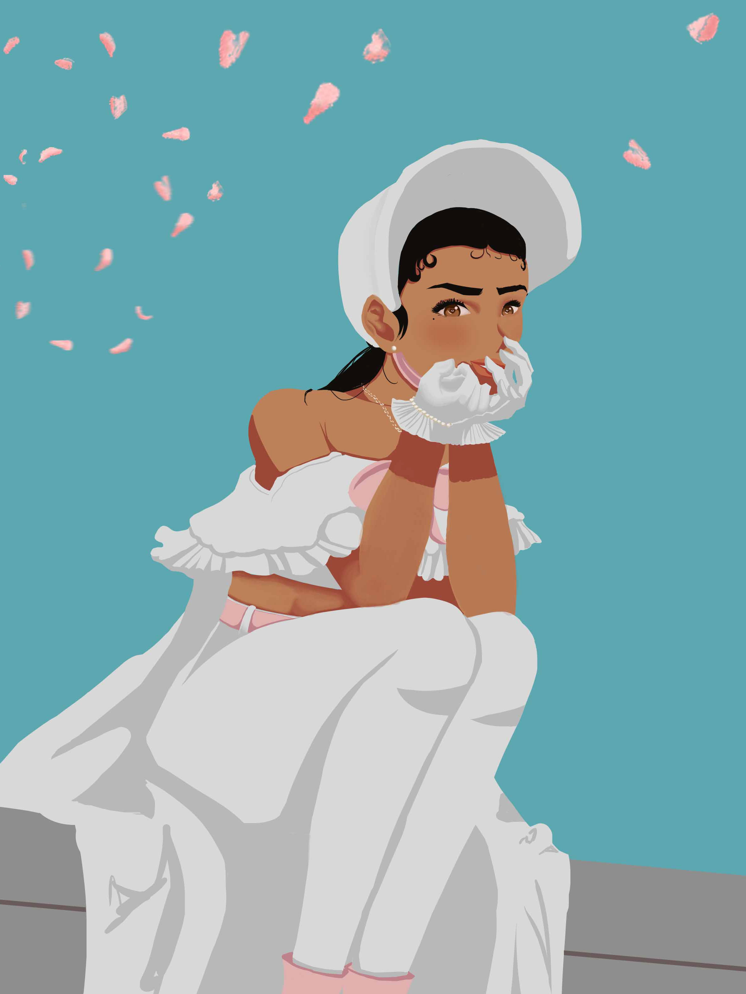
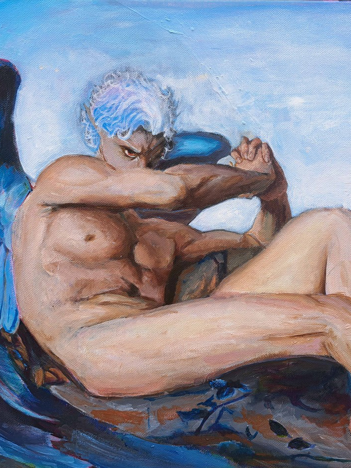
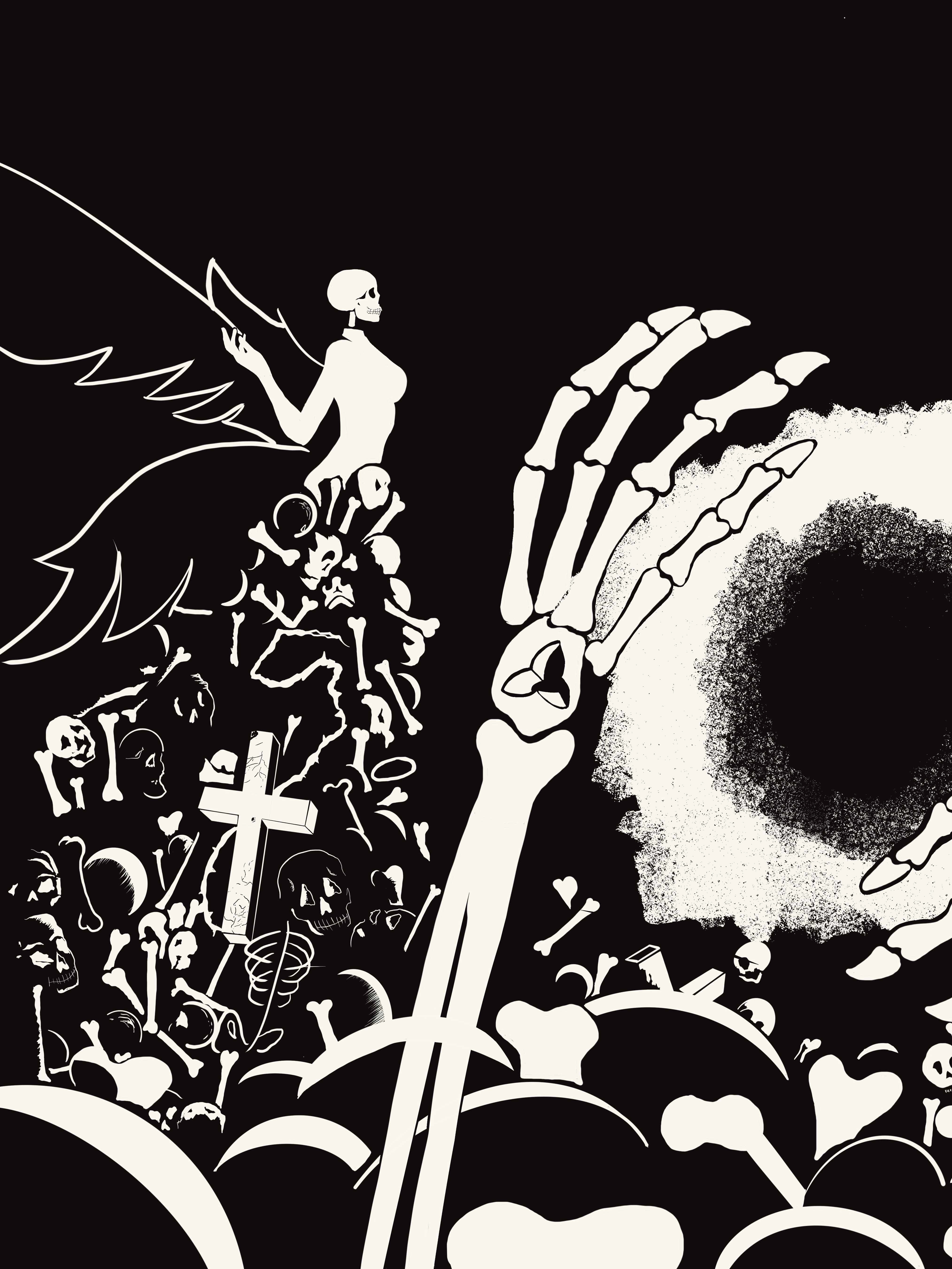
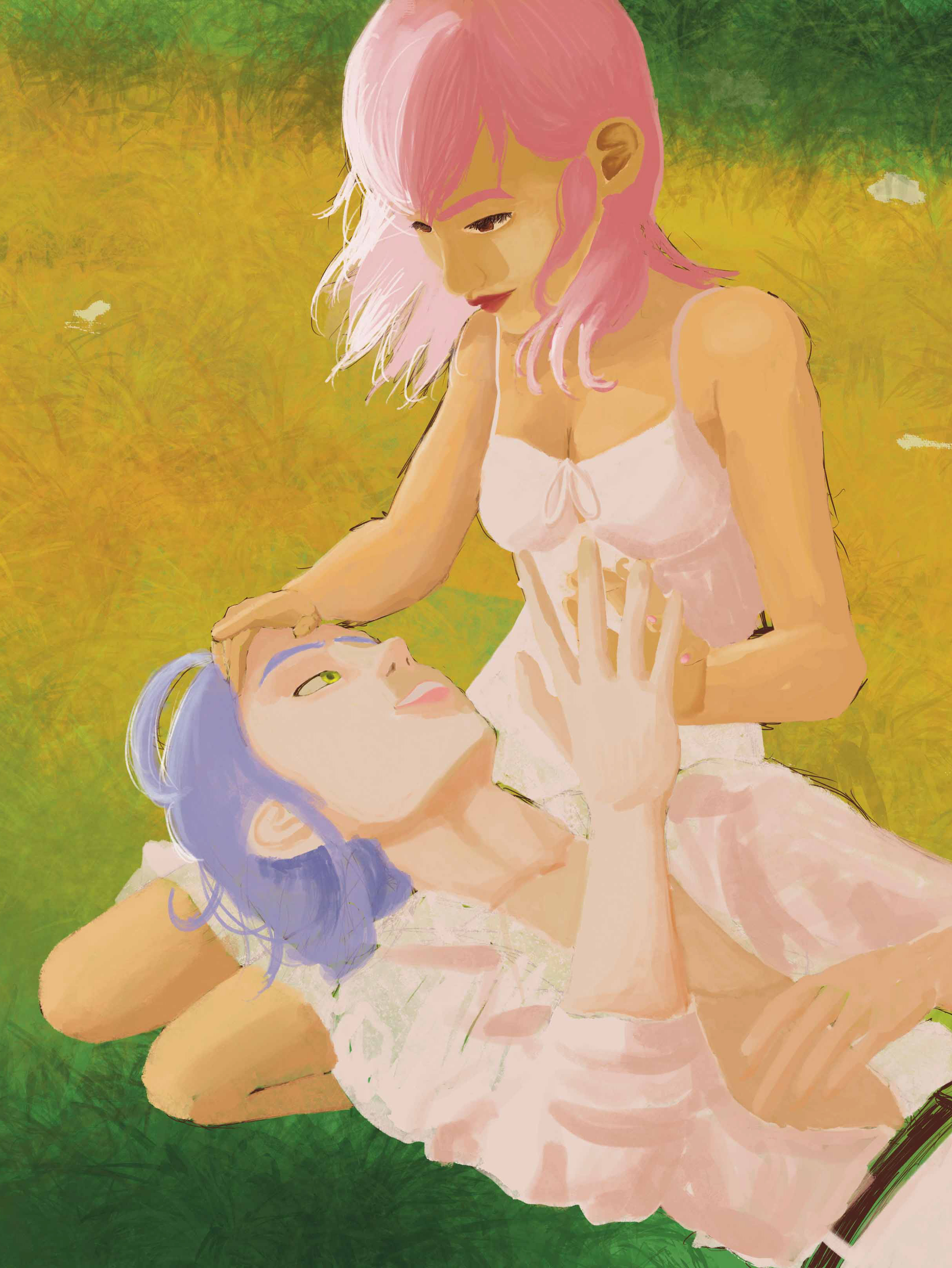
I love my original characters and this was just another opportunity for me to put Onnon, my beloved into another piece of work. I knew I wanted black-and-white imagery with a pop of colour to really emphasize certain aspects of the design itself. Said things being the header, subheads, drop caps, and anything else important. I first made the art for the magazine itself which is my favourite part. I had found the font before this project, but it stuck with me and I knew it fit Onnon’s personality. Some trouble I found was creating the deck on the front as it challenged me a bit to find a matching font, but I persevered. For the actual content of the magazine, I knew it had to be about Onnon’s versions of ‘existence’. So for the sidebar, I talked about the different versions throughout the years, and then my main text was about Onnon’s background and family life.
Spread made in Indesign

